Color Schemes Set the Tone

Munsell color sphere

Munsell color sphere

What is a color scheme?

As Dictionary.com defines it:

an arrangement or pattern of colors or colored objects conceived of as forming an integrated whole

As designers, we are trained to seek out color schemes to communicate an idea and to justify its use in our work, whether it’s a graphic logo, a painting or even an interior space.Read full post...

Read more in

So, you draw stuff for a living?

No, not really. It’s a common question and a tough one to answer. What does a graphic designer do? Webster’s defines graphic design as “the art or profession of using design elements (as typography and images) to convey information or create an effect.”

To understand what graphic design is, think about how it affects your life. Just open your kitchen cupboard, your medicine cabinet or your latest issue of (insert popular magazine here). Someone has designed almost everything you touch every day: the label on the cup of soup you have at lunch, the billboard you pass every day on your way to work, even the print on the toilet paper you use to — well, you know. Yep, that is someone’s job.  Read full post...

Read more in

How color can influence your audience

Color Blocks

Color Blocks

So, I’m driving along an unfamiliar country road enjoying the scenery when I approach a crossroads with a red octagonal sign but no words. What’s a guy to do? Instinct tells me to take my foot off the gas and come to a stop. This may seem like a no-brainer but there’s a reason for my actions. Is it the sign’s octagonal shape? Maybe. But more than likely it’s the sign’s color. Since prehistoric times, red has been associated with blood and fire. So, naturally, this guy decided to stop.

In marketing

Colors affect each of us in so many ways. Colors can even reveal your personality or mood, and yet most of us are unaware of their influence in our lives — or of the subtle ways we use them. In marketing, for example, it’s valuable to know how colors resonate with your target audience. As a marketing communications designer, I’m constantly involved with color and color decisions: How do we make this poster “edgy”? Can this brochure be more “corporate?” What will make you look at this billboard and grasp its message — all in 2.3 seconds? Just as the red of the unmarked sign alerts us to the possibility of imminent danger, there are other colors that can influence in other ways, even physiologically.Read full post...

Read more in

B2B goes digital

Business-to-business publishers have embraced the digital world. The trend among them is to put an exact copy of their print version online. The only change most of them make is to add hotlinks to their advertisers’ websites. While digital does not yet make up the majority of the total circulation of most magazines, we need to monitor this trend to see what impact it will have on advertisers.

Target Audience Delivery

I applaud those publishers who are just as concerned about verifying circulation of their digital versions as they are of their print publications. BPA, the traditional B2B circulation auditor, now offers digital circulation audits. Media planners now have access to data on target audience coverage and composition to help them make informed recommendations. Unfortunately, some publishers are still “claiming” circulations that are unrealistic, at best.

Another way that publishers are ensuring target audience delivery is through a subscription-only basis for online viewing. Readers are required to fill out a subscriber profile for the online version with the same requirements as for the print version.

Ad Size Units

When you view an online version on a regular monitor, it’s easy to browse and read. But not so when you’re using a smart phone or a tablet. You might judge a spread to have a lot of impact on a big-screen monitor. But when you have to scroll between the two pages on your handheld device, it loses legibility, visual appeal and message delivery.

Big-Screen Monitor

Big-Screen Monitor

Read full post...

Is the Three Clicks Rule dead?

The problem isn't "too many clicks" — it's "too many wrong clicks".

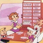
On the cartoon show The Jetsons, Jane Jetson is a full-time housewife (although the show was set in the future, it was written in the ’60s). She would push a button, and a robot vacuum cleaner would pop out to clean the rug or mechanical arms would place a fully cooked meal onto the table. That is until, in one episode, she gets “buttonitis” — stress from pushing too many buttons. Ridiculous — or is it?Read full post...

Will online marketing and social media kill the jumbotron?

Can mobile media compete with the jumbotron.

Can mobile media compete with the jumbotron?

These days, it seems like everyone is asking whether something is about to kill something else: “Will html5 kill flash?” “Will the iPad kill Kindle?”

So, with tongue firmly in cheek, I thought, “I gotta get in on this killing spree.”

In my daily romp through my normal news sites, I stumbled upon an article about a guy named Fred Ehrhart who is taking advantage of online marketing’s incredible targeting capabilities to ask a question usually reserved for jumbotrons, billboards and banners being towed behind airplanes: “Will you marry me?” The ads are all long gone, but they directed his potential bride and anyone else who clicked to this landing page.Read full post...

Website design: balancing form and function

Website design requires a balance.

Website design requires a balance.

No matter what you design — from blue jeans to loveseats to SUVs — you have to strike a balance between form and function. Thanks to the patient counsel of my interactive colleagues over the years, I’ve learned that I can’t approach web design the same way I approach print and other media. The scales tip toward functionality, which is determined by the target audience and its needs.

User experience is the number-one priority. Of course a successful website should look good, but, more important, it has to answer the needs of the audience and bring value to the user. Complicated navigation and over-designed pages only distract and confuse the audience, driving them away from the site.

When it comes to web design, balancing form and function is critical. Your design has to be engaging, interesting and compelling, but you can’t overwhelm the user with superfluous bells and whistles. Know your audience; know their needs. Let that knowledge guide you.