How a portal can offer a better user experience.
A website portal is an excellent way to brand your organization and offer members something more specific then the general information on your website. We recently updated one of our client’s physician recruitment portals by asking these three simple, strategic questions:
- What do your clients want? Make your site easy to navigate so visitors can find what they’re looking for.
- How can you reach different targets? Offer them a chance to identify themselves. This lets the site know who is reading its information, so you can customize the content to reach specific target markets.
- Why do people want to do business with you? Show off what makes you different from your competition! Make it the first thing visitors see.
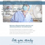
We recently did this with Baystate Health’s physician portal. The “before and after” pictures show the differences. We put a lot of thought into the user experience when designing the new portal. We also showed how strong Baystate’s employment brand is, highlighting its focus on internal diversity and other factors that make it unique among healthcare systems.
- Baystate Health’s physician portal – Before


