Is Google Glass half-full or half-empty?
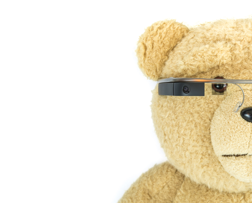
They’re only available (at $1,500-plus a pop) to select Explorers — Google’s own handpicked beta testers.
Depends on whom you ask. Google Glass will either be the biggest game changer in wearable technology, or a creepy Big Brother bust that sends people running for the exits. For those who’ve been living under a rock, Google Glass is essentially a smartphone worn as glasses.
It’s got 13 functions including hands-free camera/video/phone, Internet links, voice-activated text and commands (“OK, Glass, take picture.”), all in a heads-up display that keeps your eyes on the road or whatever/whoever is in front of you. You can even have prescription lenses. But you can’t have a pair yet. They’re only available (at $1,500-plus a pop) to select Explorers — Google’s own handpicked beta testers — who will gladly let you bid for theirs on Amazon or eBay.Read full post...








 Though we all know about color — the ones we like and the ones we don’t like — color is often misunderstood. In certain combinations, colors can scream or whisper. This is because colors are influenced by adjacent colors. In our industry, designers understand how important color choices are. To the untrained eye, color choice — when not dictated by corporate graphic standards — may appear random. Far from it. We put a lot of thought into our decisions. Certain color combinations create harmony. Contrasting colors ensure the legibility of the message we’re trying to communicate. Colors are all relative — to each other. The difference between a message that’s screaming for attention and one that should be softer in tone can be achieved by which colors are used in the design.